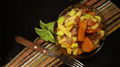
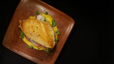
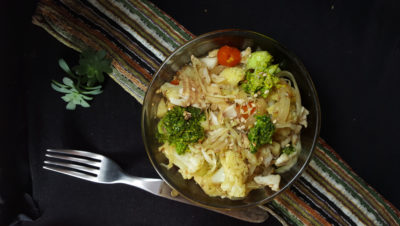
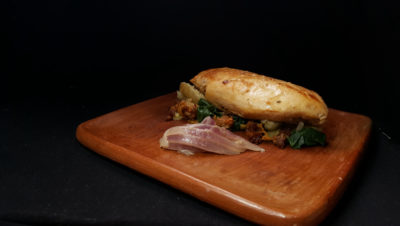
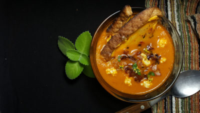
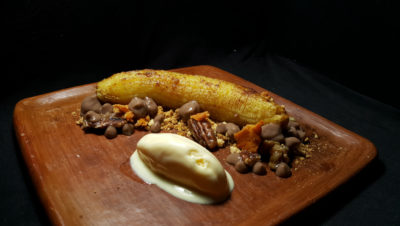
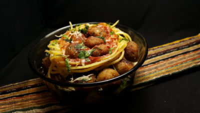
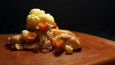
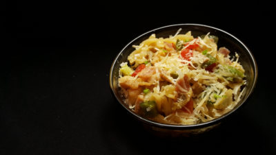
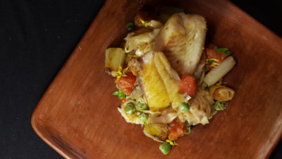
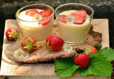
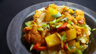
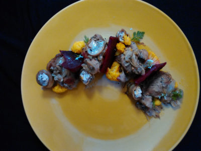
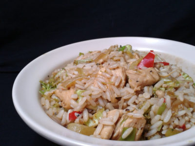
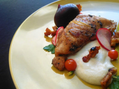
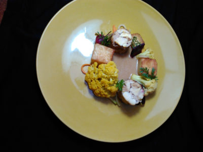
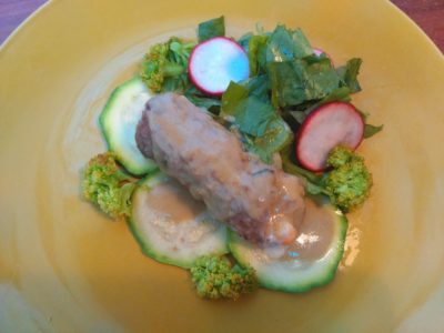
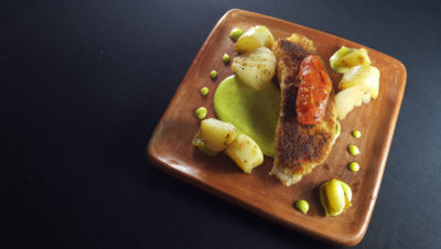
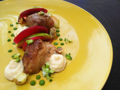
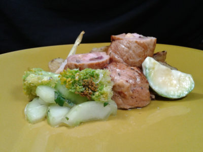
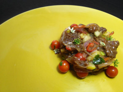
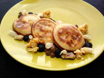
The presentation is about the aesthetic disposition of the elements in the plate to make them more visually appealing.
The key elements for presentation:
- the ingredients
- protein, carbs and vegetables
- sauces
- garnishes
- the plate
- color, form, size

In general there are no guidelines for presentation, it’s more a matter of linking and style, however i found very useful keeping in mind these aspects:
- ingredients position
- create height
- color and contrast
- textures
- sauces
- place garnishes purposefully

With those aspects in mind the next focus should be the dish harmony and these are some concepts to pay attention for it:
- keep it simple
- balance the dish with the colors, shapes and textures
- suggest the main focus point
- get the right portion sizes and the proportion between elements
- highlight the key ingredient

Finally don’t forget the main aspect: it is food, and even if it looks good the main concern should be taste and easy eating, so:
- suggest the eating order
- place the food to create flavor bites

That’s all for this post, now it’s just a matter of practice, make some drawings or sketches for visualization and try to replicate the master pieces and finally hopefully find your own style.
Some videos
Resources:
Links
- https://en.m.wikipedia.org/wiki/Outline_of_food_preparation
- https://www.webstaurantstore.com/article/200/basic-guide-to-food-presentation.html
- https://www.currytrail.in/focus-plating-garnish-a-food-photography-tutorial/
- https://www.unileverfoodsolutions.com.sg/en/chef-inspiration/chef-lifestyle-tips/food-plating-101-mastering-the-basics.html
- https://www.finedininglovers.com/article/5-videos-will-help-you-master-food-plating
- https://www.fastcompany.com/3050217/how-to-plate-food-like-a-3-star-michelin-chef
- https://food-hacks.wonderhowto.com/how-to/plate-food-like-pro-0161437/
- http://www.shoothecook.com/the-rule-of-thirds-food-photography/
Photos:
Other posts from Mise en Place
| < | > |
